el estilo
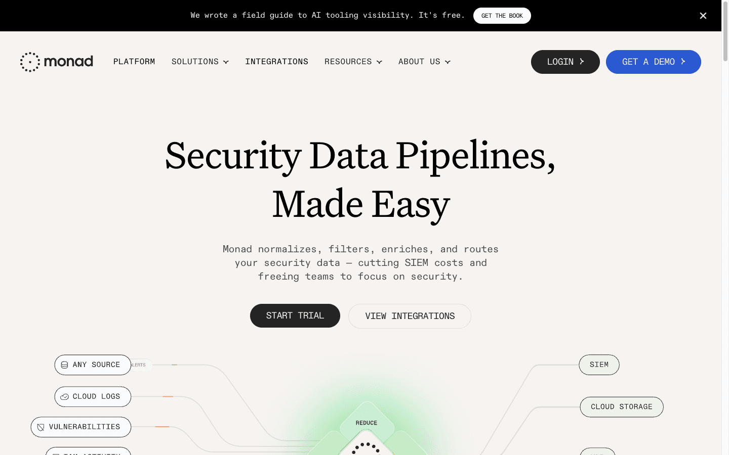
Analítica en serif al amanecer: lavados radiales de melocotón y salvia detrás del hero, Signifier con frases en itálica como inflexión de voz, Söhne en pesos intermedios (430–480) y widgets flotantes con la sombra firma de anillo de 1px + blur suave.
la paleta
la tipografía
Serif: Signifier, Georgia, serif — Display only — weight 400, italic for emphasis phrases Sans: Söhne, system-ui, sans-serif — UI and body — in-between variable weights Pesos: regular 400 · ui 430 · subheading 450 · ui-strong 480 · medium 500 display-xl — 90px · 400 · lh 1.3 · -0.025em [serif] display — 64px · 400 · lh 1.3 · -0.015em [serif] heading — 44px · 400 · lh 1.3 · -0.015em [serif] subheading — 26px · 450 · lh 1.18 · -0.01em [sans] body-lg — 22px · 400 · lh 1.4 [sans] body — 17px · 400 · lh 1.35 [sans] body-sm — 16px · 400 · lh 1.4 [sans] ui — 18px · 430 · lh 1 [sans] ui-strong — 16px · 480 · lh 1.3 [sans] caption — 15px · 430 · lh 1.4 [sans]
espaciado y forma
Radios: chip: 12px widget: 16px card: 20px feature: 24px pill: 9999px Sombras: widget: 0px 0px 0px 1px rgba(0,0,0,0.05), 0px 4px 24px 0px rgba(0,0,0,0.08) — Ring + blur — the signature elevation elevated: 0px 0px 0px 1px rgba(0,0,0,0.05), 0px 8px 40px 0px rgba(0,0,0,0.10) floating: 0px 0px 0px 1px rgba(4,23,43,0.05), 0px 20px 25px -5px rgba(0,0,0,0.1), 0px 8px 10px -6px rgba(0,0,0,0.1) Espaciado: unit: 8px card: 28px section: 140px
las reglas del estilo
Hacer
Set every headline in Signifier 400 and italicize exactly the emphatic phrase — the italic is the brand's voice inflection Keep Söhne at in-between weights (430/450/480) for UI — never jump to 600+; precision, not force Paint dawn-gradient washes behind heroes and section openers; components themselves stay white, fog, peach, or powder Float product UI as white widget cards with the ring+blur shadow recipe — charts should read as physical paper cutouts Pair peach surfaces with rust text (#5d2a1a on #fbe1d1) — the warm accent is always this duo, never peach with black Draw illustrations as thin single-weight line art (building blocks, rockets) in rust or ink on flat card fills Use compact ink pills for primary actions and plain text + arrow (→ / ↗) for every secondary link Open sections with a small "Label >" eyebrow before the big serif statement
Evitar
Do not use bold serif or bold Söhne — the heaviest weight on the page is 500 Do not fill buttons or components with gradient — gradients live only in the background atmosphere Do not use borderless floating cards; the 1px ring is what keeps the softness crisp Do not use saturated primary colors — accents stay dusty (rust, peach, powder), data-viz muted Do not set body copy in the serif — Signifier is display-only Do not exceed 24px radius on cards or square off widget corners below 12px
cópialo en tu proyecto
DESIGN.md
Tailwind v4
CSS Variables
Tokens JSON
# Steep — Style Reference > serif analytics at first light **Theme:** light · **Source:** https://steep.app · **Analyzed:** 2026-08-25 Steep makes analytics feel like a calm morning desk: a white page warmed by soft dawn-colored gradient washes (peach, rose, sage) that glow behind the hero and section openers, never as hard color blocks. The voice is literary — Signifier, a sharp editorial serif, sets every headline at regular weight up to 90px, slipping into *italic* for the emphatic phrase — while Söhne handles all UI and body text at intermediate variable weights (400–480) that feel precise without ever being bold. Ink is a soft near-black (#17191c), support text a cool gray (#777b86), and the accent story is quietly earthy: rust brown (#5d2a1a) text on a peach card (#fbe1d1), thin-line hand-drawn illustrations, and pale data-widget blues (#d3e3fc). Product UI floats as white widget cards with 16–24px radii and a signature two-part elevation — a 1px 5%-ink ring plus a large soft blur — that makes charts look like paper cutouts hovering over the wash. Buttons are compact ink pills; links are plain text with an arrow. Everything whispers competence. ## Tokens — Colors | Name | Value | Token | Role | |------|-------|-------|------| | White | `#ffffff` | `--color-white` | Primary canvas, widget cards | | Fog | `#f7f7f8` | `--color-fog` | Alternate sections, quiet cards, footer | | Mist | `#ececec` | `--color-mist` | Subtle fills, dividers | | Ink | `#17191c` | `--color-ink` | Headlines, body, pill buttons | | Gray | `#777b86` | `--color-gray` | Subtitles, secondary copy, footer links | | Charcoal | `#4c4c4c` | `--color-charcoal` | Mid-emphasis text | | Rust | `#5d2a1a` | `--color-rust` | Text on peach surfaces, warm stat accents | | Peach | `#fbe1d1` | `--color-peach` | Featured cards, warm accent surface | | Powder | `#d3e3fc` | `--color-powder` | Data-widget tints, cool accent surface | Atmosphere: radial dawn washes (peach → rose → white; sage → cream) behind heroes and section intros — gradients are environmental light, never component fills. ## Tokens — Typography **Display:** Signifier (editorial serif) — weight 400 only, italic for emphasized phrases. Fallback: `Georgia, serif`. **UI & body:** Söhne (variable) — weights 400 / 430 / 450 / 480 / 500, the in-between weights are the signature. Fallback: `system-ui, sans-serif`. | Step | Size / Weight / Line | Tracking | Face | |------|---------------------|----------|------| | display-xl | 90px · 400 · 1.3 | -0.025em | Signifier (+italic phrase) | | display | 64px · 400 · 1.3 | -0.015em | Signifier | | heading | 44px · 400 · 1.3 | -0.015em | Signifier | | subheading | 26px · 450 · 1.18 | -0.01em | Söhne | | body-lg | 22px · 400 · 1.4 | 0 | Söhne | | body | 17px · 400 · 1.35 | 0 | Söhne | | body-sm | 16px · 400 · 1.4 | 0 | Söhne | | ui | 18px · 430 · 1.0 | 0 | Söhne (buttons, nav) | | ui-strong | 16px · 480 · 1.3 | 0 | Söhne (card titles, labels) | | caption | 14–15px · 400–430 · 1.4 | 0 | Söhne | ## Tokens — Spacing & Shape | Purpose | Value | |---------|-------| | Density | Calm — centered hero, 3-col card rows, wide quiet gutters | | Base unit | 8px | | Section gap | 120–160px | | Card padding | 24–32px | | Button padding | 0 20px (fixed-height pill) | | Element | Radius | |---------|--------| | Small chips / inputs | `12px` | | Widget cards | `16px` | | Mid cards | `20px` | | Feature cards | `24px` | | Buttons | pill (`9999px`) | **Shadows** (the signature — always ring + blur): - Widget: `0 0 0 1px rgba(0,0,0,0.05), 0 4px 24px rgba(0,0,0,0.08)` - Elevated: `0 0 0 1px rgba(0,0,0,0.05), 0 8px 40px rgba(0,0,0,0.10)` - Floating: `0 0 0 1px rgba(4,23,43,0.05), 0 20px 25px -5px rgba(0,0,0,0.1), 0 8px 10px -6px rgba(0,0,0,0.1)` ## Guidelines - Set every headline in Signifier 400 and italicize exactly the emphatic phrase — the italic is the brand's voice inflection - Keep Söhne at in-between weights (430/450/480) for UI — never jump to 600+; precision, not force - Paint dawn-gradient washes behind heroes and section openers; components themselves stay white, fog, peach, or powder - Float product UI as white widget cards with the ring+blur shadow recipe — charts should read as physical paper cutouts - Pair peach surfaces with rust text (#5d2a1a on #fbe1d1) — the warm accent is always this duo, never peach with black - Draw illustrations as thin single-weight line art (building blocks, rockets) in rust or ink on flat card fills - Use compact ink pills for primary actions and plain text + arrow (→ / ↗) for every secondary link - Open sections with a small "Label >" eyebrow before the big serif statement **Don't** - Do not use bold serif or bold Söhne — the heaviest weight on the page is 500 - Do not fill buttons or components with gradient — gradients live only in the background atmosphere - Do not use borderless floating cards; the 1px ring is what keeps the softness crisp - Do not use saturated primary colors — accents stay dusty (rust, peach, powder), data-viz muted - Do not set body copy in the serif — Signifier is display-only - Do not exceed 24px radius on cards or square off widget corners below 12px